Typed Subatomic Styling: Part 2 — Comparison to Styled-Components
CSS-in-JS is a popular approach to styling components within React apps. These libraries are much more sophisticated than simply inline styles. I chose one popular library, styled-components, to compare to the Subatomic CSS approach I detailed in my previous post. I look at the clarity of components, the amount of flexibility, and performance.
HTML structure
styled-components encourages a one-to-one mapping between React components and HTML elements. If you have a nav item that is made of a <li> containing an <a>, with them sitting inside a <ul> and all surrounded by a <nav>, then you could create components like so:
export const NavLink = styled.a`
    padding: 0.5rem 1rem;
    color: blue;
`;

export const NavItem = styled.li`
    list-style: none;
`;

export const NavList = styled.ul``;

export const Nav = styled.nav`
    padding: 0 1rem;
`;
And then use them like so:
<Nav>
    <NavList>
    <NavItem>
        <NavLink href="/features">Features</NavLink>
    </NavItem>
    <NavItem>
        <NavLink href="/pricing">Pricing</NavLink>
    </NavItem>
    <NavItem>
        <NavLink href="/sign-in">Sign in</NavLink>
    </NavItem>
    </NavList>
</Nav>
It’s convenient for you to make a component for each particular HTML element. But, the <NavList> and <NavItem> components conceptually do not add much. They do in the final HTML with their <ul> and <li>, but at the component level they are mostly noise.
It would be much cleaner to have just <Nav> and <NavItem>. Semantically we have a bunch of nav items inside a nav. The other components are really just implementation details of HTML. It would be much cleaner to have:
<Nav>
    <NavItem to="/features">Features</NavItem>
    <NavItem to="/pricing">Pricing</NavItem>
    <NavItem to="/sign-in">Sign in</NavItem>
</Nav>
How could we create these components?
const NavLink = styled.a`
    padding: 0.5rem 1rem;
    color: blue;
`;

export const NavItem = styled(({ to, className, children }: { to: string; className: string; children: React.Node }) => (
    <li className={className}>
        <NavLink href={to}>{children}</NavLink>
    </li>
))`
    list-style: none;
`

export const Nav = styled(({ className, children }: { className: string; children: React.Node }) => {
    return (
        <nav className={className}>
            <ul>{children}</ul>
        </nav>
    );
})`
    padding: 0 1rem;
`;
I find this much better at the usage side, but much more complicated than the previous component definitions. Also, the backticks are not sitting and reading so elegantly now. There’s a loss of clarity.
So what’s an alternative? Consider with subatomic classes instead:
.list-reset {
    list-style: none !important;
}

.px-2 {
    padding-left: 0.5rem !important;
    padding-right: 0.5rem !important;
}
.py-4 {
    padding-top: 1rem !important;
    padding-top: 1rem !important;
}

.text-blue {
    color: blue !important;
}
export function NavItem({ to, children }: { to: string; children: React.Node }) {
    return <li className="list-reset">
        <a href={to} className="px-2 py-4 text-blue">{children}</a>
    </li>;
}

export function Nav({ children }: { children: React.Node }) {
    return <nav className="py-4">
        <ul>
            {children}
        </ul>
    </nav>;
}
The CSS may feel like a once-off, but actually we can build a palette of these subatomic styles with the colors and padding and utilities common between many of our components. You get a really reusable set of classes that enforce consistency between components, and soon you can create new components without having to add any new CSS.
Within the components, there’s much less going on than the second styled-components approach, but it’s performing the same task.
The key thing for me is the HTML tags and class names are easily readable. There’s not much else getting in the way of clarity.
We can use these components in that same nice, concise way:
<Nav>
    <NavItem to="/features">Features</NavItem>
    <NavItem to="/pricing">Pricing</NavItem>
    <NavItem to="/sign-in">Sign in</NavItem>
</Nav>

### Dynamic styles based on props

Ok, we haven’t stretched styled-components’ abilities yet. Let use one powerful ability: use different styles depending on what props are passed.

Let’s make a list of items. Each item is coloured. The items will alternate by color: red, blue, orange, red, blue, orange, and again and so on.

We can do this by dividing the item index by 3, and depending on the remainder (either `0`, `1`, or `2`), we’ll use a particular color.

This is how we’d write this using styled-components:

```tsx
export const Item3Colors = styled.div`
    color: ${(props: ItemProps) => {
        const index3 = props.index % 3;
        return index3 === 0 ? "red" : index3 === 1 ? "blue" : "orange";
    }};
    font-family: sans-serif;
    font-size: 1.25rem;
`;
We interpolate in a function that will calculate the value for the color property given the current props.
And with Subatomic CSS classes:
.font-sans {
    font-family: sans-serif !important;
}

.text-lg {
    font-size: 1.25rem !important;
}

.text-red {
    color: red !important;
}
.text-blue {
    color: blue !important;
}
.text-orange {
    color: orange !important;
}
export function Item3Colors({ children, index }: ItemProps) {
    const index3 = index % 3;
    const colorName = index3 === 0 ? "red" : index3 === 1 ? "blue" : "orange";
    return (
        <div className={`font-sans text-lg text-${colorName}`}>{children}</div>
    );
}
We also interpolated strings, but we calculated a composite class name instead of CSS rules.
Now let’s measure the difference!
Measuring the effect on the user experience
I have built three versions to compare. The first is a baseline with no styling at all. This is to measure the impact of React itself, and to give us a good idea of what overhead our dynamic styling is adding. The second is using styled-components. And the third is using the Subatomic CSS approach described in this post.
You can find links to these projects here:
- No styles: Deployed on Netlify · Code on CodeSandbox
- styled-components: Deployed on Netlify · Code on CodeSandbox
- Subatomic CSS: Deployed on Netlify · Code on CodeSandbox
A good way to measure how this will affect the user is using Google’s online PageSpeed tool. It not only gives an overall score, but also break down key metrics such as time for the user to see something (first contentful and first meaningful paint), and the delay until they can interact with the site (estimated input latency).
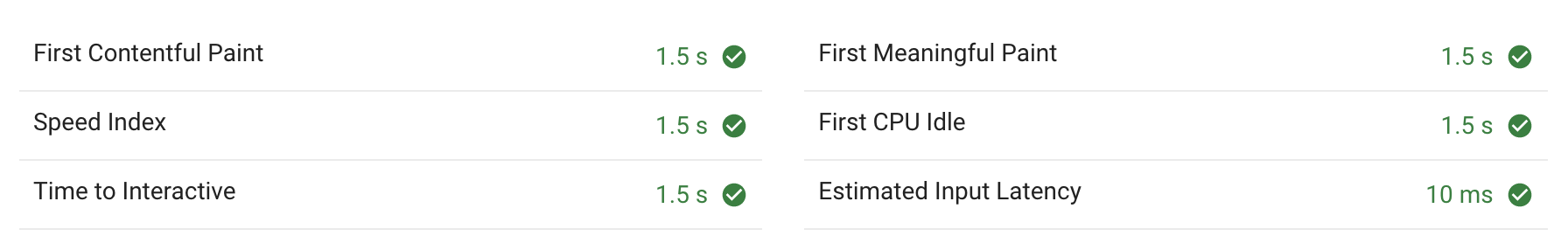
No styling: 100 items
No styling: 1000 items
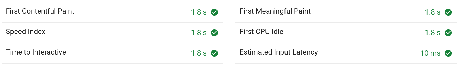
Styled components: 100 items
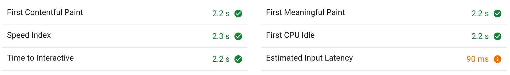
Styled components: 1000 items
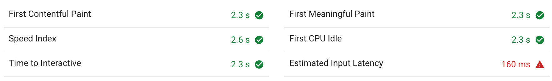
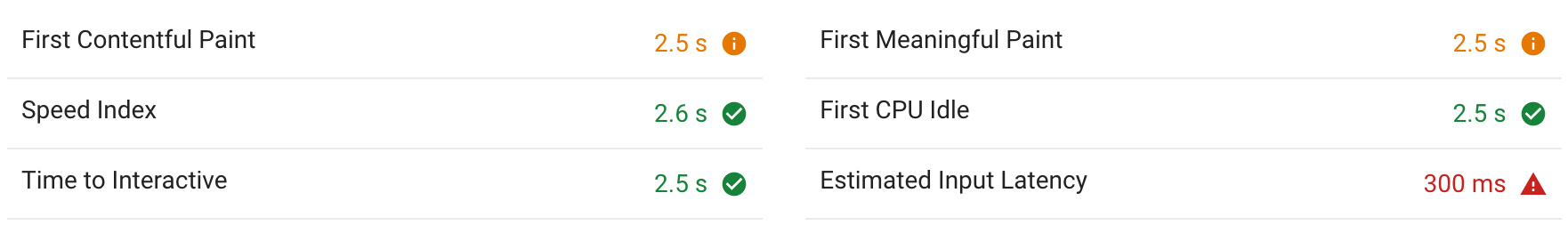
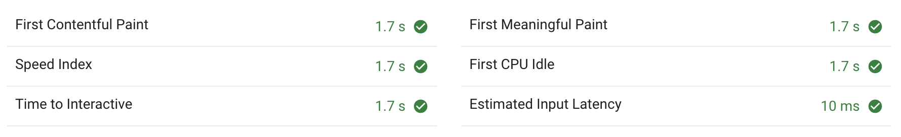
CSS classes: 100 items
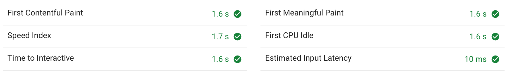
CSS classes: 1000 items
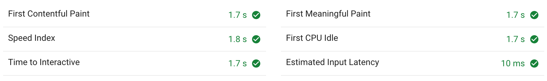
First Contentful Paint & Time to Interactive
Both of these numbers measure the same here: likely because it’s the time when React has finished rendering the component.
With 100 items, the styled-components approach (1.8s) took only slightly longer than the pure CSS approach (1.6s). Not styling at all took 1.5s.
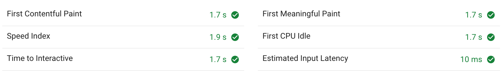
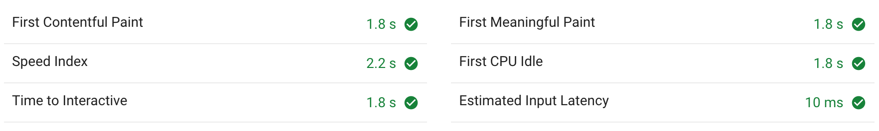
When rendering 1000 items, we start to see a gap widening:
- No styling: 1.7s
- Styled-components: between 2.2–2.5s
- Subatomic CSS: between 1.7–1.8s
Estimated Input Latency
The bigger concern is the Estimated Input Latency. The CSS approach has no difference to having no styles: there’s a latency of 10ms.
When styled-components is used to render 1000 items, there’s an input latency between 90–300ms. That’s a significant delay, and the experience to a user would be a feeling of sluggishness.
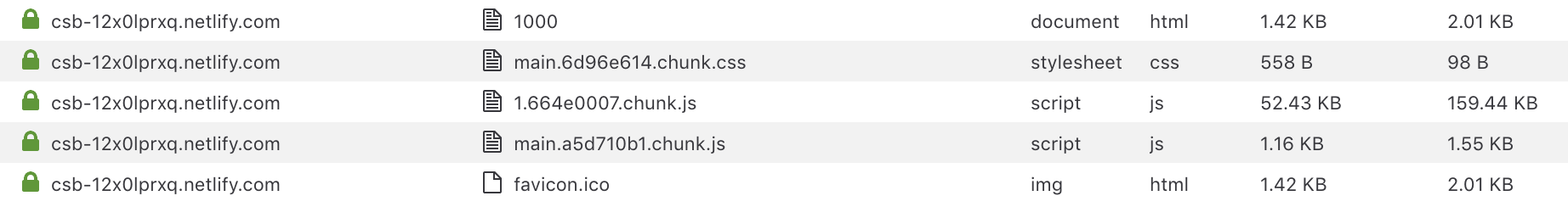
Download sizes
Using Firefox’s web developer tools, let’s see the size of the assets download by the user’s browser.
No styles
Let’s compare the number of kilobytes downloaded. First, no styles:
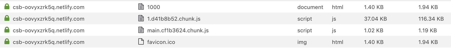
This is our baseline. 37KB + 1KB of gzipped JavaScript. Unzipped it’s 117KB. The first 1.xxx.js file contains our dependencies such as React. The main.xxx.js is our app’s JavaScript such as custom components.
Subatomic CSS
Next, we have the subatomic CSS approach. We now have a main.xxx.css file that is less than one kilobyte in size.
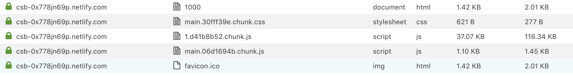
The 1.xxx.js is essentially the same size. We added no extra dependencies. The main.xxx.js size has increase, but only by a 1/3 of a kilobyte.
We have gained styling, but with not much overhead at all.
Styled-components
Lastly, let’s see the download sizes for styled-components.
While our main.xxx.js is also not much larger, our 1.xxx.js dependencies is larger. A 15KB difference gzipped doesn’t sound like much, but uncompressed that’s 43KB. It’s over 1/3 larger than before. That’s extra code that has to be parsed and executed before our user sees anything. On a mobile device, this can be significant extra time and power.
Server rendering
Styled-component’s documentation recommends an approach like following for server-side rendering:
import { renderToString } from 'react-dom/server'
import { ServerStyleSheet } from 'styled-components'

const sheet = new ServerStyleSheet()
try {
    const html = renderToString(sheet.collectStyles(<YourApp />))
    const styleTags = sheet.getStyleTags() // or sheet.getStyleElement();
} catch (error) {
    // handle error
    console.error(error)
} finally {
    sheet.seal()
}
As components are rendered, they produce their styles. The styles.collectedStyles() method captures all these styles. You then have to insert the style tags into the served HTML.
With Subatomic CSS, there is no need to capture the styles produced or insert extra tags. They are all in the CSS file already that you link to. There’s no extra work needed at all for server-side rendering.
Hover, focus, active, and media queries
One of the benefits of styled-component’s use of CSS rules is that you can use pseudo classes such as :hover and :focus, or media queries.
Let’s look at writing styling for a link that is normally red and without underlining, and then when hovered becomes both orange and underlined. First with styled-components:
export const Link = styled.a`
    color: red;
    text-decoration: none;
    &:hover {
        color: orange;
        text-decoration: underline;
    }
`;
It’s understandable if you’ve used something like SCSS. The & mean we are target the element itself, so we only have to add the :hover and the rules inside.
Here’s how we’d approach the same problem with subatomic styles:
.text-red { color: red !important; }
.hover\:text-orange:hover { color: orange !important; }

.no-underline { text-decoration: none !important; }
.hover\:underline:hover { text-decoration: underline !important; }
function Link({ href, children }: { href: string; children: React.Node }) {
    return <a className="text-red no-underline hover:text-orange hover:underline" href={href}>{children}</a>;
}
What’s up with those backslashes before the colons? That’s because we want the colon to be treated literally instead of like a pseudo element. We then add the actual :hover pseudo element at the end, so that the rule is only active when the element is being hovered. There is no .hover\:text-orange rule without :hover, so by default this class will have zero effect until the user hovers.
We use similar approaches for :focus and :active and (one of my favorites :focus-within. We add the prefix to the actual class name so we can see it when declaratively use them as class names in components.
Media queries and breakpoints
You can use the same technique for media queries and breakpoints:
.text-red { color: red !important; }
.text-blue { color: blue !important; }
.text-orange { color: orange !important; }

@media (min-width: 36rem) {
    .sm\:text-red { color: red !important; }
    .sm\:text-blue { color: blue !important; }
    .sm\:text-orange { color: orange !important; }
}

@media (min-width: 48rem) {
    .md\:text-red { color: red !important; }
    .md\:text-blue { color: blue !important; }
    .md\:text-orange { color: orange !important; }
}
function Link({ href, children }: { href: string; children: React.Node }) {
    return <a className="text-red sm:text-blue md:text-orange" href={href}>{children}</a>;
}
Once you have a kit of these, they are really useful. You can achieve sophisticated behaviour while keeping your components easy to read.
It’s all just CSS. It’s just clever class naming.
Well that’s great, I might hear you say. But can you combine media queries with interpolated values? With styled-components, I can punch a function into my styling rules even inside a @media query.
Using the above responsive text color classes, we can.
type ColorName = "red" | "blue" | "orange";

function Link({
    href,
    color,
    colorSm,
    children
}: {
    href: string;
    color: ColorName;
    colorSm: ColorName;
    children: React.Node
}) {
    return <a className={`text-${color} sm:text-${colorSm}`} href={href}>{children}</a>;
}
Here we used a TypeScript defined type to constrain the allowed color name values to only red, blue, or orange — anything else would be a compile-time error.
It is used like so:
<Link color="orange" colorSm="red" href="/">Orange at XS, Red at SM</Link>
<Link color="blue" colorSm="orange" href="/">Blue at XS, Orange at SM</Link>
There’s other enhancements we could do, such as adding a colorMd prop or making them optional, and these are easy to add. I will give more full featured examples in future blog posts.
User experience vs developer experience
Approaches such as styled-components sound great because they make our, the developers, lives easier. If we are able to ship things faster, then that means we can improve our users’ experience faster.
However, I think it’s not so straightforward to assume that an improvement to developer experience (DX) does make enough of a meaningful difference to the UX. Those decisions to improve DX might have made the UX worse by making it slower to load, by adding latency to input, and by using more of the user’s battery. That’s a deficit you can’t just simply get back.
Approaches such as Subatomic CSS provide a great developer experience while not compromising the user experience. Adding minimal overhead is a feature in itself. Niceties to the DX that TypeScript can offer such as autocompletion and class name checking all get compiled away.
Plus, you then have less need to tackle bundle splitting and lazy loading of JavaScript. If your JavaScript is minimal to begin with, then you won’t have to spend extra time optimizing its delivery. And that is even more time we can spend building and shipping.
Coming up
I hope you’ve enjoyed the series so far. Please feel free to reach out to me on Twitter for feedback or suggestions. In future blog posts I plan to cover these topics:
- Comparison to styled-system
- Using CSS variables in a Subatomic CSS system
- The TailwindCSS library
- Container queries